Creating a more transparent and reassuring emergency care experience.
Emergency room visits are often characterized by uncertainty, stress, and a lack of communication. Patients and families frequently report that the most frustrating part of the entire experience is not necessarily the wait itself, but the inability to understand:
How long the wait may be
What happens next
Why other patients are being seen first
Whether their condition is worsening
How to communicate with staff during long waits
This lack of transparency can increase anxiety, reduce patient satisfaction, and place additional burden on hospital staff who must repeatedly answer the same questions.
Project Overview
Design Challenge
How might we provide patients and families with greater visibility into the emergency care process without disrupting clinical workflows or compromising patient privacy?
Proposed Solution
ClearER is a multi-platform patient communication ecosystem that provides real-time visibility into the emergency department journey.
The platform includes:
Patient mobile application
Family tracking portal
Emergency department kiosk
Nurse communication dashboard
The system provides personalized updates, estimated wait ranges, care stage visibility, educational content, and family communication tools designed to reduce uncertainty throughout the patient journey.
Problem

UX Researcher
Literature review
Competitive analysis
Journey mapping
Interview planning
My role
Product Designer
Product strategy
Information architecture
Wireframes
High-fidelity designs
Prototyping
Design system
Product Manager
Feature prioritization
Healthcare workflow analysis
Accessibility planning
KPI definition
Tools Used

Research & Data Collection
Research focused on:
Emergency department workflows
Patient satisfaction studies
Healthcare communication research
Hospital operations
Emergency triage systems
Healthcare accessibility standards
Additional research examined common pain points reported in emergency departments:
Long perceived wait times
Anxiety from uncertainty
Family communication breakdowns
Information overload
Difficulty understanding triage prioritization
Competitive Analysis

MyChart

Epic Systems patient tools

Cleveland Clinic patient apps

Cerner patient portals
Mount Sinai patient tracking systems
Key finding:
Most platforms focus on appointment management and records access rather than real-time emergency care communication.

Key Insights
-
Many patients are willing to wait when they understand why.
Design implication: Provide visibility into care stages rather than focusing solely on wait estimates.
-
Family members often have little visiblity once a patient enters treatment.
-
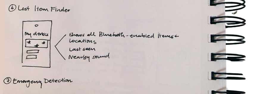
Items such as glasses, wallets, keys, hearing aids, and medication containers are frequently misplaced, leading to unnecessary stress.
-
Many caregivers reported wanting occasional updates that their loved ones completed important daily tasks while still preserving independence and privacy.
Design Process
1. Problem Definition
The project began by identifying common pain points experienced by independently living older adults and mapping opportunities where technology could provide meaningful assistance without becoming intrusive.
The design challenge is:
How might we help older adults maintain independence while reducing the cognitive burden of everyday memory-related tasks?
2. User Personas
PRIMARY
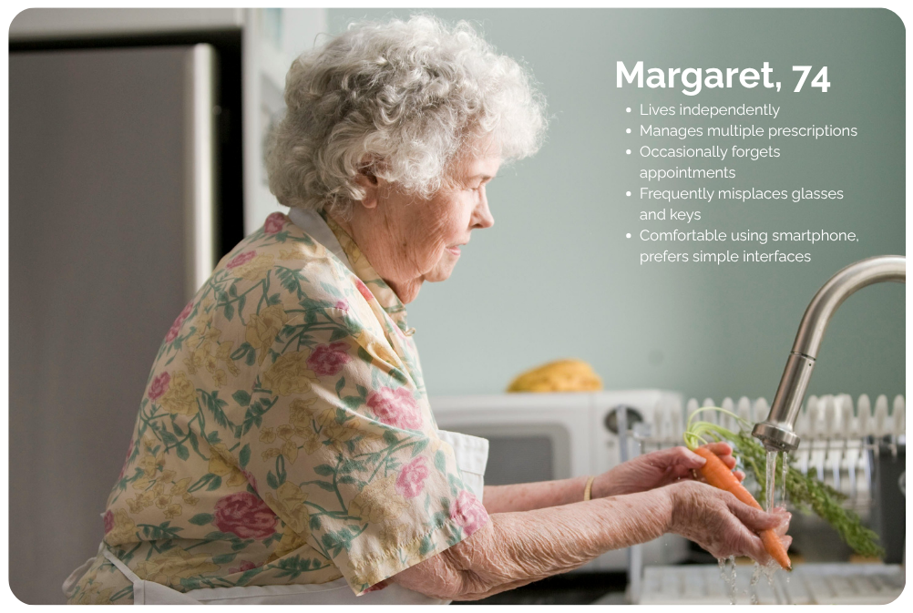
SECONDARY

3. Information Architecture
The experience was intentionally simplified into five primary sections:
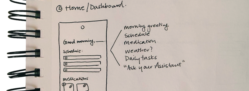
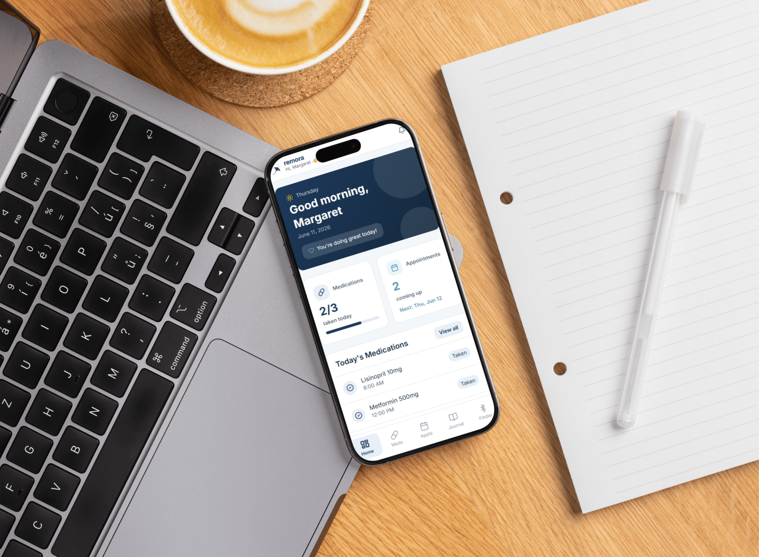
Home Dashboard
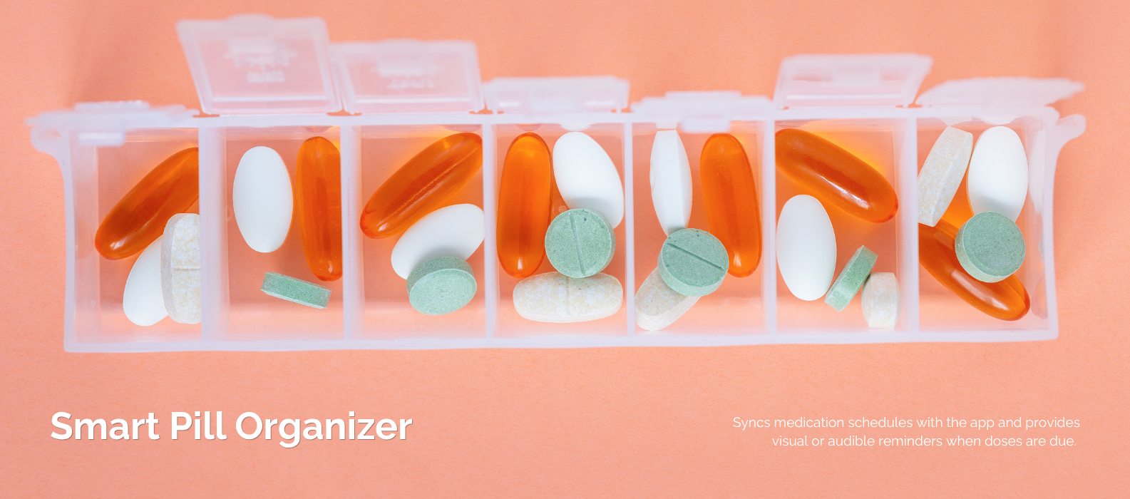
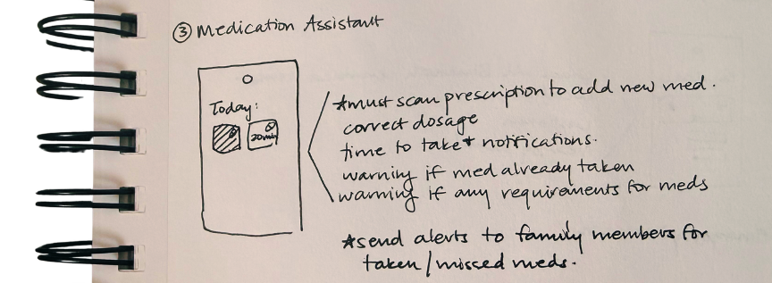
Medications
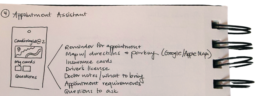
Appointments & Calendar
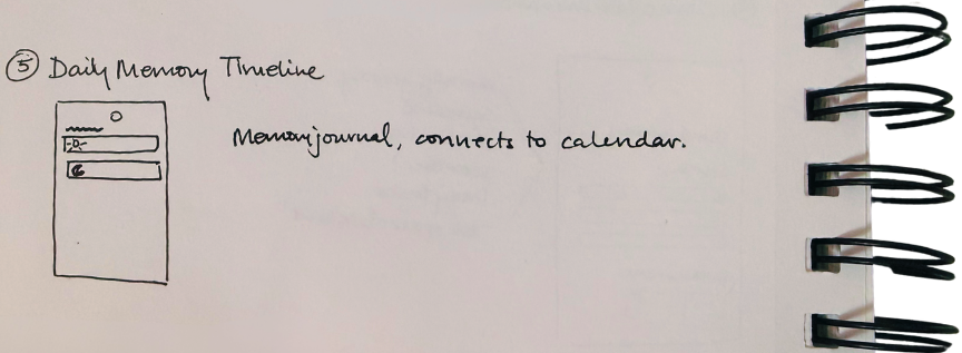
Journal
Find My Items
Reducing navigation complexity allows users to quickly complete tasks with minimal decision-making.
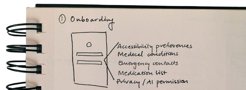
4. Wireframing
The experience was intentionally simplified into five primary sections:
Home Dashboard
Medications
Appointments & Calendar
Journal
Find My Items
Reducing navigation complexity allows users to quickly complete tasks with minimal decision-making.
Prototype Development
A high fidelity interactive prototype was created in Figma to stimulate the complete experience from onboarding through everyday use.
The prototype includes navigation between the dashboard, medication management, calendar scheduling, personal item tracking, and profile management, allowing users to experience how the system would function as an integrated product.
Transitions were intentionally kept simple to mirror the straightforward interaction model and to maintain focus on usability rather than visual effects.

PROTOTYPE
Conclusion & Next Steps
Remora explores how thoughtful product design can support aging populations through simplicity rather than technological complexity. By focusing on familiar interactions and essential daily tasks, the platform aims to reduce cognitive burden while promoting independence and confidence.
Future iterations would include formal usability testing with older adults and caregivers, refinement based on participant feedback, expanded accessibility accommodations, and integration with additional health management systems.
Although still conceptual, this project demonstrates a human-centered approach to designing technology that empowers users to live independently while maintaining dignity, autonomy, and connection with their support systems.
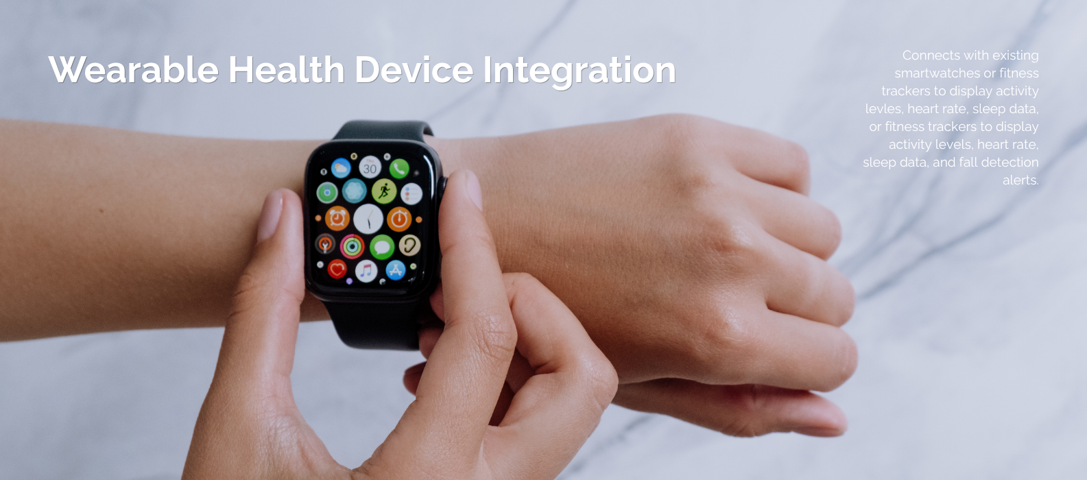
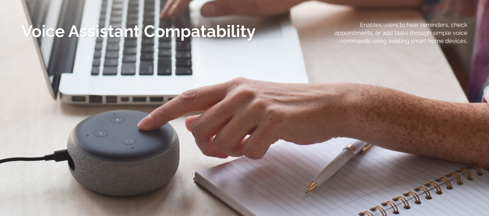
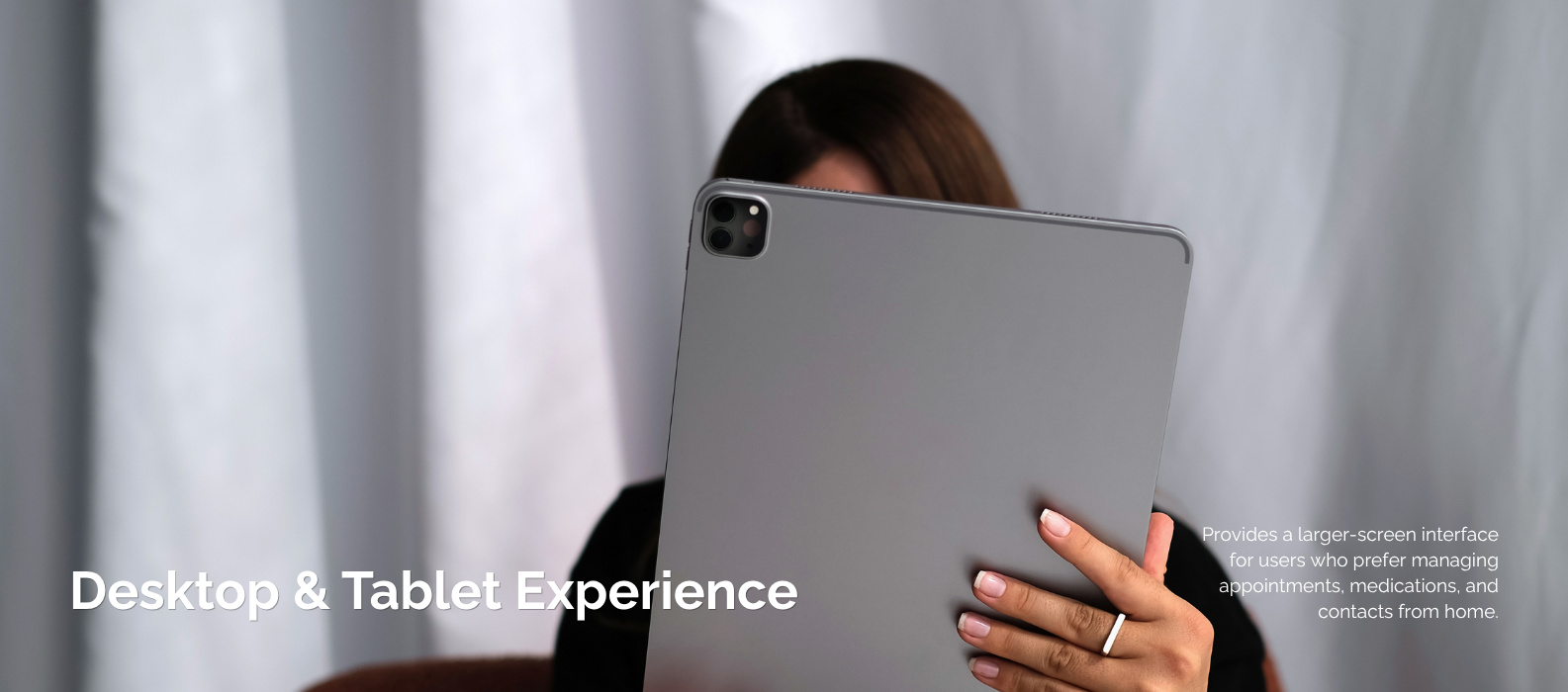
Expanding the Ecosystem